Russia Number 1 A Rossica Society Article
Welcome to the Rossica
showing of Russia No. 1. It is our intention to show you
the design development that led up to the issuance of this
stamp. We will show some of the types of cancellations that
can be found on this issue and we will dwell a bit on some
of the varieties that have helped make this stamp a
favorite of the collector of Russian stamps.
Some of the images in
this presentation are copies made from copies and do not
always look as we would like them to, but they are
sufficient to allow the reader to form an
image.
Russia is one of the few
countries to have issued postal stationary before adhesive
stamps. In 1845, envelopes impressed with a 5-kopeck stamp
were issued for use by the St. Petersburg and Moscow City
Posts. Tsar Nicholas I decreed on 27 September 1848 that
postal stationary was to be used throughout Russia
effective 1 December 1848.
Tsar Alexander II agreed
to a proposal on 12 November 1856 that the State Council
introduce adhesive postage stamps for the use of the
populace.
After the return of
Councilor Tchaiukowsky from his two-year study of stamp
production in Great Britain and Germany, the engraver
Kirchner of the Printing Office for Government Obligations
at St. Petersburg produced a series of circular essays for
the proposed 10-kopeck stamp.
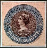
Figure 1-This is a
bi-color version of the Mercury Head Essay. Note the
intricacy of the engraving and the post horns below the
head indicating its postal relationship. This essay is also
known in single color versions.
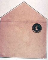
Figure 2-This essay has
been trimmed at its border and pasted upon an envelope to
better judge its appearance as a postage stamp.
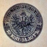 Figure 3-The second
essay produced is known as the Eagle Essay. It was produced
in both single and bi-color versions. Here again we see the
marvelous detail and perfection of engraving.
Figure 3-The second
essay produced is known as the Eagle Essay. It was produced
in both single and bi-color versions. Here again we see the
marvelous detail and perfection of engraving.
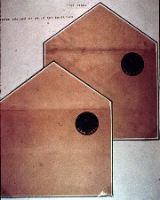
Figure 4-This essay was
also pasted upon an envelope in order to pass upon its
appearance as a postage stamp.
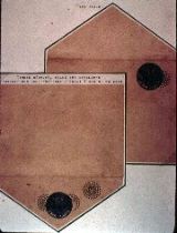
Figure 5-Here we see the
judging process carried out one step further. Sample
cancellations have been applied.
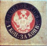
Figure 6-The second type
of Eagle Essay was now produced and seen here in a bi-color
version. This is similar to the actual postal stationary in
use at that time. The top inscription reads "10 kopeck per
lot" or around 1 ounce and the bottom inscription says "1
kopeck for the envelope." Note that, unlike the first Eagle
Essay, the eagle now holds an orb and scepter in its claws.
Again, note the posthorns below.
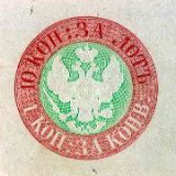 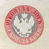
Figure 7-Here are other
bi-color versions of the same essay.
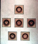
Figure 8-Here is a group
of brown-banded essays with various background colors.
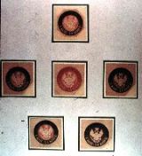
Figure 9-Another group of
additional color combinations is shown here.
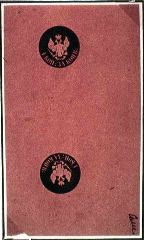
Figure 10-The same essay
was produced t�te-b�che, in black on pink paper.
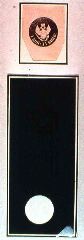
Figure 11-Here we see a
trial perforation in the round.
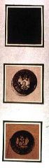
Figure 12-Here we are
looking at sample cancellations using a fantasy number 12
in a rectangle within a dotted circle.
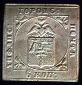
Figure 13-This is the
Tiflis local. Though not generally acknowledged, it is
actually the first officially issued adhesive stamp of
Russia. It was produced by the Viceroy of the Caucasus with
the consent of the Tsar. It was issued in Tiflis in
November of 1857. This was a month before the generally
accepted Russia No. 1 was distributed to the post offices
and two months prior to their official date of issue. The
Tiflis stamp continued in use until June of 1858. This
stamp was embossed in strips of five on heavy cream colored
carton board. Only three single copies are known to have
survived though rumor has it that another single copy and
one on cover do exist. It first received international
attention when the Faberge Collection was auctioned in the
fall of 1939. This particular copy was lot #2 in that sale.
It was purchased by Stibbe and in the 1957 Robson Lowe
auction was sold to Paul Davidson of Chicago. It
subsequently passed into the hands of the late Robert
Baughman and on 24 March 1971 was sold by Robert Siegel to
its present owner. This stamp portraying the coat of arms
of Tiflis can be considered the world's first Topical
Stamp. In the upper left quadrant of the coat of arms we
see Noah's Ark on Mr. Ararat. At the upper right, the
plowed fields of the surrounding countryside. In the center
is a knight on horseback while the bottom half is occupied
by a winged staff and medical caduceus. For those
interested in further details concerning this stamp, I
recommend an article by our former president Gregory
Salisbury in Rossica Journal #46-47 of 1955.
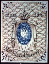
Figure 14-This is a
beautiful artist's rendition of a proposed acknowledged, it
is actually the first officially issued adhesive stamp of
Russia. It was produced by the Viceroy of the Caucasus with
the consent of the Tsar. It was issued in Tiflis in
November of 1857. This was a month before the generally
accepted Russia No. 1 was distributed to the post offices
and two months prior to their official date of issue. The
Tiflis stamp continued in use until June of 1858. This
stamp was embossed in strips of five on heavy cream colored
carton board. Only three single copies are known to have
survived though rumor has it that another single copy and
one on cover do exist. It first received international
attention when the Faberge Collection was auctioned in the
fall of 1939. This particular copy was lot #2 in that sale.
It was purchased by Stibbe and in the 1957 Robson Lowe
auction was sold to Paul Davidson of Chicago. It
subsequently passed into the hands of the late Robert
Baughman and on 24 March 1971 was sold by Robert Siegel to
its present owner. This stamp portraying the coat of arms
of Tiflis can be considered the world's first Topical
Stamp. In the upper left quadrant of the coat of arms we
see Noah's Ark on Mr. Ararat. At the upper right, the
plowed fields of the surrounding countryside. In the center
is a knight on horseback while the bottom half is occupied
by a winged staff and medical caduceus. For those
interested in further details concerning this stamp, I
recommend an article by our former president Gregory
Salisbury in Rossica Journal #46-47 of 1955. stamp which
was submitted to the Imperial Russian Postal Authorities by
the firm of Gottlieb Hasse and Sons of Prague in 1856. This
might be considered the origin of the first stamp as its
design characteristics are very much like the issued
version. Sir John Wilson, former keeper of the Royal
Collection, owned four different color combinations of this
item. They were: blue frame with carmine center; brown
frame with blue center; carmine frame with green center;
green frame with carmine center. A fifth combination blue
frame with orange center is believed to exist also.
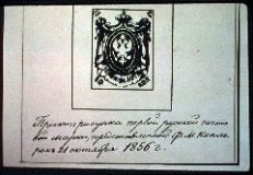
Figure 15-This pen and
ink sketch has a notation attributing it to the designer
Franz Keppler of the Russian Printing Office. It is dated
October 21, 1856.
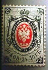
Figure 16-This is an
original artist's rendition in oil paint on specially
coated, perforated paper in the exact size of the issued
stamp. This just recently came to light and is believed to
be unique.
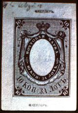
Figure 17-This is the
first impression from the engraved die. At the top and
bottom we see Keppler's name denoting it as his work.
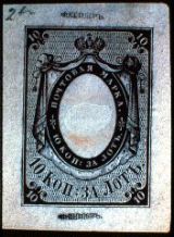
Figure 18-While the
previous impression was made on thin unglazed paper, the
second impression is on thick glazed paper. Note the break
in the glaze in the center. While the cause of this is
unknown, one can hazard a guess. We suggest that this proof
had an image of some kind printed in the center and that it
was possibly out of register or unapproved. Therefore, an
attempt was made to eradicate it, causing the broken
surface. The key to this assumption lies in the double
impression of the designer's name at the bottom. This
suggests that a second die, also bearing the designer's
name at the bottom, had been used for the center. This is
the only area where a double impression is visible. Please
note that this proof was not created by the same die as the
previous Figure. Note the single dot after the 10 at the
left in the lower curved "10 kopeck" inscription. We
believe that this die gave birth to the cliche which
printed the rare "dot after 10" variety.
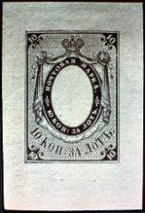
Figure 19-This is a third
impression on soft wove paper.
Figure 20-Here is a die
impression on perforated wove paper.
Figure 21-Here we see the
first of a series of color proofs. (Green/purple)
Figure 22-Another color
combination. (Green/red)
Figure 23-Another
combination (Mauve/light orange)
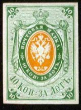
Figure 24-Another
combination. (Green/light orange)
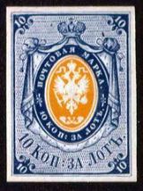
Figure 25-Another color
combination (Blue/orange)
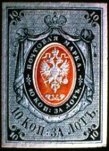
Figure 26-Here is the
dark blue and dark orange combination which was chosen for
the 20-kopeck stamp.
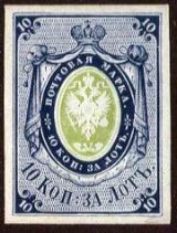
Figure 27-Another color
combination. (Blue/light green)
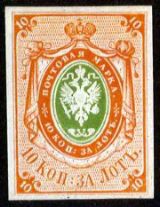
Figure 28-Still another
color combination. (Orange red/dark green)
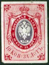
Figure 29-This is the
last of our color trials. (Red/purple). V. Rachmonov in his
article for the Collector's Club Philatelist of September
1953 list eleven other known color combinations. The eleven
and the nine shown here gives us twenty combinations.
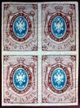
Figure 30-This is not an
actual block of four. It is a die proof on India paper. One
other such die proof is known and was sold in a Robert
Siegel auction to a New York dealer for a very small sum as
it was badly mutilated. This dealer had the item cleaned,
thins and tears were repaired and the paper sized to give
it more body and to hide the work done on it. It was then
offered as a fine and rare proof. Such perfidy is,
unfortunately, not rare and the collector must always be on
guard.
Figure 31-This is a full
sheet of the original paper used for printing Russia No. 1.
The impression in the borders, starting at the left side,
reads "Postal stamps 10 kopeck in silver" The bottom bears
the date "1857."
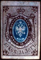
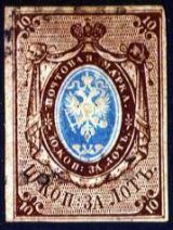
Figure 32-We see here
what is normally described as an unused stamp. This means a
stamp which had been applied to an envelope and had gone
through the mail service, but for some reason had escaped
cancellation. At a later date the stamp was removed from
the envelope. This type of stamp is generally characterized
by the rubbed look of the embossed center.

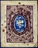
Figure 33-This is another
example of an unused stamp. The color difference is due to
the photographic film used to make the Figures and is not
the stamp.
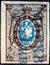
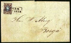
Figure 34-Here is a stamp
canceled on the first day of issue. The postmark reads
"MOSCOW 1 Jan. 1857." This is an error in the year date
plug since it should be 1858. Two copies of such an error
are known.
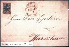
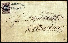
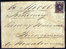
Figure 35-This cover was
addressed to Warsaw and was postmarked Kovno 1 Jan. 1858,
the first day of usage. Note the stamp is pen canceled but
also has a figure "2" in manuscript. The explanation for
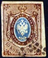
this is not known.
Figure 36-This pen
canceled stamp is important because it illustrates the
exact spacing of the stamps on the sheet. Notice that at
the upper right corner we can see the upper left side of
the adjoining stamp. Please notice the extremely long serif
on the "1" in the upper right corner.
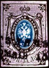
Figure 37-Here is an
example of a straight two-line town cancel.
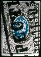
Figure 38-This is a boxed
two-line town cancel.
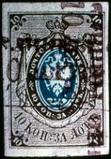
Figure 39-A rare double
cancel in red. The vertical cancel is a straight two line
type while the horizontal cancel is a boxed two-line
type.
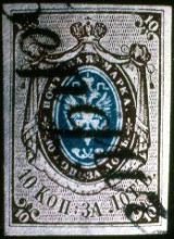
Figure 40-This is the
rare script cancellation of Berdichev.
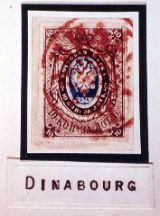
Figure 41-Here we have
the single red circle cancellation of Dinaburg.
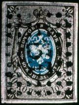
Figure 42-Here is a boxed
dot cancel #133 for Ovrich, Zhitomir Province.
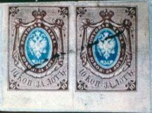
Figure 43-Multiples of
No. 1 are scarce, and while a strip of 5 is known and a
strip of 3 not tied to a cover exists, pairs are not common
and, of course, are most desirable. This pair has a simple
pen cancellation.
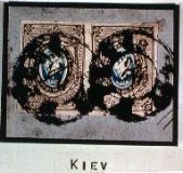
Figure 44-This pair shows
the double circle cancellation of Kiev.
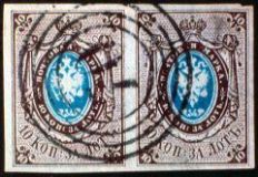
Figure 45-Another pair,
this time with the four-ring circular cancel of Sokolow,
Poland.
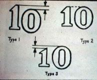
Figure 46-On this drawing
we see three types of the number "10" to be found in the
upper right corner, Type I shows both figures to be the
same size but the zero is set lower than the "1." Type II
shows the zero is larger than the "1" but both are of even
height at the top. Type III has the figure "1" smaller than
the zero and does not match the setting of the zero at
either the top or bottom.
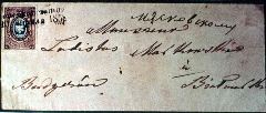
Figure 47-Here is a cover
with a stamp with the "Fulpius retouch," named after the
man who first recorded it. A close-up is on the following
Figure.
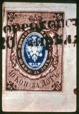
Figure 48-The close-up
shows the dashes in the upper right background have been
strengthened. They appear heavier than on previous
examples.
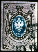
Figure 49-This stamp with
a Type I upper right corner illustrates another variety. On
the dark brown oval encircling the blue center, the "K" of
"KOPECK" is missing its upper right arm.
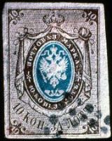
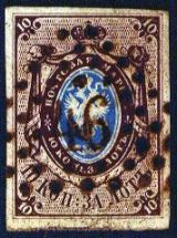
Figure 50-This stamp has
a Type II upper right corner. The figure "1" in the lower
left corner has an unusually long serif.
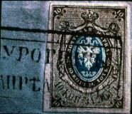
Figure 51-With tongue in
cheek, we will call this stamp a forerunner of the broken
"10" variety. Just below the figure "1" in the brown left
corner can be seen a small white piece which has broken
away from the "1."
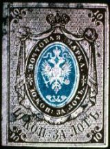
Figure 52-An example of
the broken "0" in the lower left corner. Note that here the
"0" is broken but the "1" is intact. The upper right corner
is Type II.
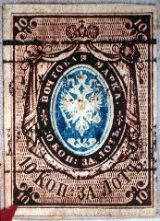
Figure 53-Here is the
broken "10" variety in full bloom. The bottom of the "1"
has disappeared and the bottom of the "0" has crumbled away
completely.
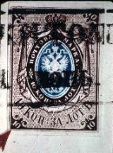
Figure 54-Here is another
example of the broken "10" variety.
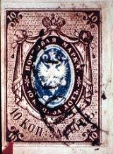
Figure 55-This is known
as the "keyhole" variety. Look at the "0" in the lower left
corner. The name becomes obvious.
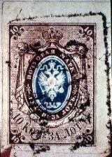
Figure 56-In this stamp
we can clearly see that the "keyhole" was caused by some
foreign matter on the cliche.
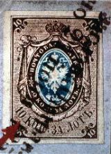
Figure 57-This is the
rarest variety of No. 1, the so-called "dot after 10"
variety. If you remember at the beginning of the show we
saw a die proof of this self same type.
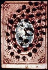
Figure 58-Here is another
example of the "dot after 10" variety. With this second
example, the original show comes to an end. The following
pictures are additional number ones on and off cover.
Enjoy!!
|

 Contact the Editor